Making Your Video Ads Work on Different Screen Sizes
When someone says video ads get attention, they're not wrong. But getting that attention doesn't mean much if people can't properly watch your ad on their screen. Whether someone’s holding a phone, browsing on a tablet, or leaning back at a desk with a full-size monitor, the way your video ad looks and works can make or break its success. If your ad isn’t readable, watchable, or engaging based on the screen they're using, that view might go to waste.
That’s why it’s smart to think about screen size before you ever hit record. When your video ad adjusts well to different screens, it feels like it was made just for your audience, no matter where they are or what device they’re using. A well-placed, well-designed video ad meets people where they are, on whatever screen they have in front of them.
Understanding Screen Size Impact
A video ad that looks amazing on a laptop can easily turn into a headache on a phone screen. The layout, text, and even your message might not come across the same way once the screen shrinks down. Each screen size affects how viewers take in your video. That’s why screen-specific planning is one of the smartest things to focus on when creating your ad.
Let’s look at how screen sizes can shape a viewer’s experience:
- Mobile Devices: People usually hold their phones vertically. So landscape videos might not use all of the screen space unless someone turns their phone sideways, which doesn’t always happen. If the text is too small or moves too fast, it's easy to lose your message.
- Tablets: These sit somewhere between phones and computers. There’s more room to work with, but finger taps can block small buttons or video controls. If the layout doesn’t work here, users may skip or scroll away.
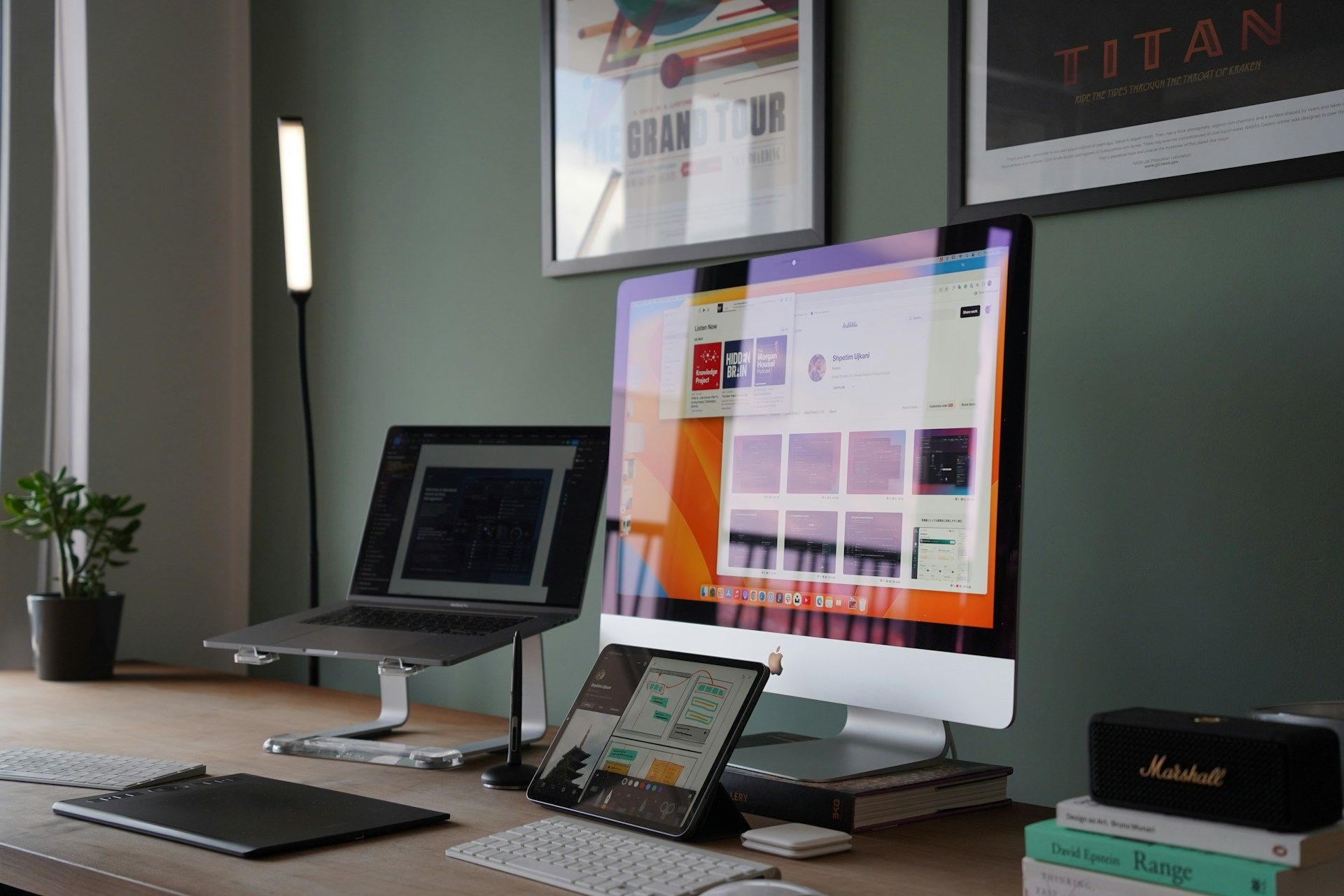
- Desktops and Laptops: With more visual space, you get to do more. But extra room also means mistakes stand out. If your video was built just for a smartphone, it might look stretched or awkward when blown up on a large screen.
Each screen has its own behavior patterns too. Someone on a computer might spend more time watching your full ad, while someone on mobile might only give you a few seconds. That means the way you edit, time, and structure your content should adjust based on what device your viewers are using.
Knowing how screens affect your ad helps your video show up clearly, deliver your message quickly, and connect with the people watching it. Skipping this step means missing out on a lot of potential attention just because it wasn’t easy for them to watch.
Designing Video Ads For Mobile
When designing for mobile, less is usually more. The screen is small and people are often on the move. That means your ad needs to load quickly, get to the point fast, and look good without needing sound.
Keep your message front and center. Avoid placing important details in the corners of the video, because those can get hidden by app buttons, captions, or fingers tapping the screen.
Here are a few tips that help mobile video ads perform better:
1. Stick to square or vertical formats, which fill more of the mobile screen.
2. Put your main message in the first three to five seconds.
3. Use large, readable text. Tiny fonts are easily lost on small screens.
4. Add captions so people can follow what's happening, even with the sound off.
5. Keep the video short. Under 30 seconds is a good target.
Let’s say you’re running an ad for a new food delivery service. On mobile, your video should show the app in action, quick shots of tasty meals, and a bold promo code flashed front and center. No long intro, no soft music buildup, just straight to the point.
By keeping mobile users in mind from the start, you make sure your message lands, even when someone’s just killing time while waiting in line. The goal isn’t to overcomplicate. It's to make the experience easy, fast, and worth watching.
Creating Videos For Tablets And Desktops
When working on video content that shows up right on tablets or desktops, you get more room to work with. But that extra space doesn’t mean you should throw in every graphic, motion, or flashy transition you can think of. Design choices still matter, and viewers expect something clean and easy to follow.
Tablet screens are larger than phones but still often used hand-held, which makes their experience more like mobile than desktop in many ways. You may want to focus your layout to avoid detail being lost if someone holds the tablet further from their eyes. Big, simple visuals usually do best. Give people a clear visual path, one that leads them through your message without friction.
On desktops or laptops, you're playing with a full-sized display. That opens the door for rich visuals, widescreen video, and higher detail. Here’s where you can bring in layered elements like logos, graphics, or taglines, but only if they stay within readable zones and don’t fight for attention. Don’t make viewers squint or shift their eyes all over the place. Keep motion smooth and pacing steady.
Also remember how viewing habits shift by device. People browsing on desktop are likely sitting down, already focused. They’re more likely to watch a longer message if it holds their interest. Meanwhile, tablet users may be in a relaxed setting like a couch or kitchen, casually browsing. With that in mind, avoid fast cuts or complex sequences that might get lost or skipped.
If your video looks too stripped down on a larger screen, it can feel cheap or rushed. But if it's overly complex, you risk distracting from the real message. Strike the balance based on where and how it’ll be seen.
Testing And Optimization Across Devices
No matter how good a video looks during editing, there’s one way to make sure it connects: testing. Videos don’t behave the same way across all screen types or platforms. That’s why checking and adjusting makes the difference between an okay ad and one that pulls people in.
Start by testing different video layouts. Maybe one version works better in square format while another fits best in widescreen. You can run short A/B tests to get a feel for which styles work best based on where they show up.
Here are a few things worth testing early on:
1. Does the text remain clear and readable across all screen sizes?
2. Does the message feel rushed or too slow depending on the device?
3. Is audio needed, or does the ad still work silently?
4. How does the viewer engage at the 5-second mark across tablet and desktop?
5. Can the viewer clearly see logo placement regardless of screen?
After testing, look at performance data. Are people dropping off after a few seconds? Are click-through rates higher on phones versus desktops? These small data points help you shape the next round so each version of the video can feel like it was made just for that screen.
Analytics tools can show patterns in behavior too. Maybe viewers on tablets like slower transitions while desktop users prefer quick edits. Use those insights to help you shape upcoming content with smarter edits.
Maximizing Reach With Responsive Video Advertising
To get the most out of your video ad investment, the content needs to adapt. That’s where responsive design makes a difference. It helps you avoid wasting good content just because it’s stuck in the wrong frame.
Responsive video layouts shift and stretch automatically depending on where they play. If you’ve created a core video asset that works across square, vertical, and wide formats, then you can repurpose more easily. It also saves time when launching a broader campaign.
If you're trying to bring in viewers across various platforms and devices, think about these strategies:
1. Use adaptive formats so content looks good on any screen.
2. Create shorter and longer cuts of the same video to fit mobile and desktop users.
3. Ensure captions are styled in a way that doesn’t get chopped off on narrow screens.
4. Keep key elements like headlines or callouts away from screen edges.
Just because a video plays doesn't mean it plays well. Watching a stretched or clipped version on the wrong-sized screen can ruin the first impression. Responsive video keeps your message clean and focused, from smartphones to large monitors.
Getting Your Videos Device-Ready
Creating video ads that work across screen sizes isn’t just about resolution. It’s about making sure people actually watch, engage, and respond. Think of your video as a flexible tool built around one clear message that needs to show up right, no matter where it appears.
Keeping layout, clarity, and pacing in mind across mobile, tablet, and desktop will help your ads not only be seen but actually connect. Testing different cuts and using responsive formats helps you adjust along the way without having to start over every time.
Getting it right across all screens takes planning and a sharp eye for how people watch depending on their device. When done well, your video ads will feel tailor-made for the person watching, no matter where they are. That’s where your next big response starts.
Ready to elevate your marketing efforts with impactful ads? Learn how to make every frame count with smarter approaches to video advertising that connect across devices. At Oddball Creative, we're here to help you stand out on any screen.