Why Users Leave Your Website Within Seconds
You worked hard to build your website. You chose your layout, added photos, wrote up some content, and made it live. But when you check your analytics, you realize people leave almost as soon as they get there. What’s going wrong?
Ever wonder why visitors click off your site within just a few seconds? It can feel confusing, but it usually comes down to a few small issues that create a big problem. People want quick answers, smooth experiences, and designs that feel easy to use. If your site is falling short in those areas, visitors won’t stick around to explore.
Slow Loading Times
Nothing makes someone click the back button faster than a website that takes forever to load. People don’t have the patience to wait around, especially if they’re on their phone and moving fast. If your homepage takes too long to open, chances are they never see any of it.
Slow loading times can happen for a bunch of reasons. Maybe your image files are huge. Maybe there’s a lot of stuff running in the background that slows everything down. A slow page feels broken to someone just landing on it, even if everything else works fine.
You don’t need to know every technical detail, but there are some common issues that could be slowing things down:
- Uncompressed images: Big pictures can drag loading times out way too long
- Too many plugins or heavy themes: Some features sound nice but cause delays
- Cluttered homepage: The more your site has to load, the longer it takes
- Missing browser caching: Without it, users always load your site from scratch
- Poor hosting services: Some servers just take longer, even when everything else is clean
If your website feels laggy, your visitors probably notice it too. Tidying up the backend by shrinking images, streamlining plugins, or simplifying your homepage can make a big difference. Every extra second it takes to load is a chance someone clicks away.
Poor Navigation
You’ve probably been on a website where you couldn’t figure out where to go. Maybe the menu was hidden, or there were too many pages sending you in different directions. That kind of confusion sends most people looking for an easier site to browse.
Good navigation helps visitors feel in control. They can find what they need without too much effort. Bad navigation does the opposite. It creates dead ends, distractions, and frustration. Visitors who get lost usually leave instead of sticking around to figure it out.
Here are a few signs your website navigation might need some work:
- Menus with too many tabs or drop-downs
- Labels that are unclear or too vague
- Links that go in circles or lead to error pages
- Important pages not listed in the main menu
Navigation doesn’t have to be fancy. A clean layout with clear menu choices is all it takes. Visitors should always know how to move forward. If you simplify their path, they’re more likely to explore what your site offers.
Lack Of Mobile Optimization
More people browse the internet on their phones than on desktop computers. If your site isn’t designed to work smoothly on a small screen, you’re going to lose visitors. A layout that looks great on a big monitor can easily fall apart on a phone. When that happens, users back out.
Think about all the ways mobile design can fail. Buttons shrink too small to tap. Text gets cut off. Menus stop working or fill the whole screen. Images won’t resize. These things might seem minor, but they add up fast.
A mobile-friendly website should feel made for the device it’s on. People should be able to tap around easily without pinching, zooming, or scrolling sideways.
Look for these common mobile issues:
- Text that’s too small or doesn’t reflow properly
- Menus that are hard to find or don’t open
- Images that stretch past borders or overlap other content
- Buttons and links that are hard to press without zooming
- Forms that don’t display correctly or cut off fields
The easiest way to test your site is to pull it up on your own phone and try to use it like a visitor would. Try filling out a form, clicking around, or reading some text. If anything feels awkward, it’s worth fixing. Mobile users will appreciate the extra effort, and your bounce rate will thank you for it.
Intrusive Pop-Ups And Overwhelming Ads
Ads and pop-ups can help grow your business, but only when they’re handled with care. Nothing drives users away faster than being bombarded the moment they land on a page. You know the experience—one pop-up about cookies, another for a newsletter, and one more offering a discount code. It’s too much.
Instead of helping your message reach more people, too many pop-ups just interrupt. It feels like work to navigate past them, and most users don’t want to bother.
Here are a few tips to ease the overload:
- Limit one pop-up per visit, not multiple
- Wait at least 30 seconds before it appears, giving users time to settle in
- Make it simple to close, even on a phone
- Stay away from full-screen pop-ups that block the entire page
- Keep the message short and helpful, not pushy
Pop-ups should feel like part of the flow, not a roadblock. If a user can scroll, click, or read without constant interruption, they’re more likely to stay longer and come back later.
Unappealing Or Outdated Visual Design
Looks matter. A website that feels fresh and visually balanced gives visitors a reason to trust what you’re saying. On the other hand, a site that looks outdated or sloppy makes people wonder if it’s even being kept up anymore.
Things move fast online. Design trends and technology evolve quickly. Fonts, colors, or layouts that were on point five years ago might now feel uncomfortable or off-putting.
There are a few quick ways to freshen up your design:
- Use no more than two or three main colors for a clean, modern look
- Stick to fonts that are easy to read and consistent sitewide
- Keep good spacing between sections, text, and images
- Use headers to break up long chunks of text
- Replace outdated photos with current, professional visuals
Try to think of your website like a digital storefront. If the windows are dusty and the sign is peeling, people won’t walk in. But when it feels inviting right away, they’ll be open to whatever your site has to offer.
Make Design Work For You, Not Against You
Your website doesn’t just need to look good. It needs to work well, too. If it’s slow, hard to use, messy on a phone, or filled with pop-ups, people won’t wait around. Instead, they’ll move on quickly to the next option — which could be a competitor.
A better user experience can be built step by step. Clean up your visuals. Cut load times. Simplify the layout and menus. Make browsing on a phone feel natural. When the design fits the user’s needs, it puts them at ease and keeps them engaged.
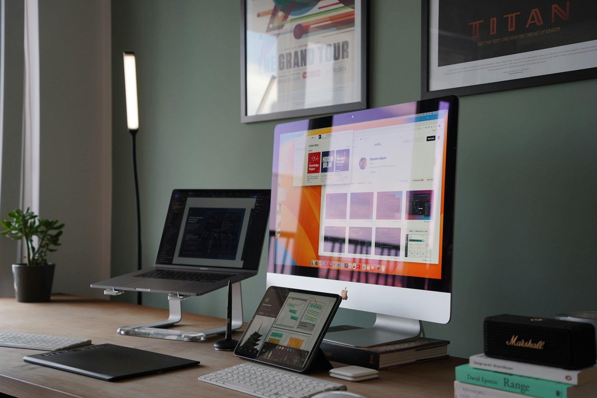
At Oddball Creative, we help you figure out what’s working, what’s not, and how to fix it. If your website isn’t holding people’s attention, let us help bring that spark back.
Creating a website that draws people in and keeps them engaged can be challenging, but it's key to success online. If you find that your site needs a little help, explore our range of services to enhance your
website design. The team at Oddball Creative knows how to make your site both functional and stylish, helping you connect effectively with your audience and keep them coming back for more.